Little book
- Eleonora Gonzalez

- May 1, 2020
- 2 min read
Updated: May 7, 2020

My project was to create a little book about my experience at 46XY graphic design studio. I did a work experience with this amazing studio to learn more about graphic design.
I wanted something simple but colorful and pop at the same time.

For the cover I chose to create a really minimalist and geometric girl (who represents myself). I also wanted to play with the front and back covers, so I decided to do the front of the girl but also the back of her. On the cover I also restyled the logo of the studio, choosing the simplest version of the “real” logo.

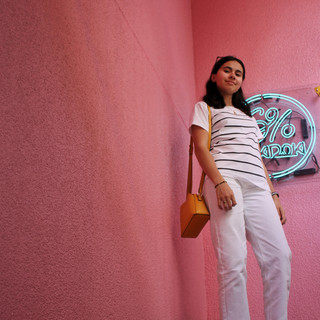
For the first page I decided to create this really pop page with two different interpretations of the name of the studio: the first one (on the top) is the complex version of the logo on the cover. I really wanted to mix digital and paper, maturity and childish. The second one is an exponential, representing a more scientific interpretation, but keeping a funny touch. Here I used again the yellow color to create a connection with the cover girl. Next to this page I put a short paragraph about myself together with a picture of me.

All the book is written in Italian and French. I used a bold font for the Italian part because it was the principal language. For this project I also wanted to insert a few photos to accompany the text. I took myself all the pictures and then I played with them to create something clean and illustrating well the text, but serving also as a transition between different parts of the book. For the transition pages I decided to choose a color that would contrast with the yellow of the cover and the first page. I chose blue for this, as this is a color that I really like. Thus I used it all around the book.

Finally, in the last page I wrote a few words to thank the studio and I added a copy of the letter that the studio’s manager wrote for me.


Comments